

Making Be Me’s Homepage Easier to Understand, Explore & Trust
Helping users find the right period-care products, get their questions answered, and feel confident in their choices.
Duration
1 Week
Role
UX Designer
Tools
Figma · Figma Jam
Outcome
3rd Place
Responsibilities
Homepage Redesign
APPROACH
Research-Led Design
Goal
Emotional Trust
UNDERSTAND
Context
Be Me is a feminine wellness brand committed to more than selling products. Its promise sits in community, menstrual health education, advocacy, expert collaboration, and grassroots initiatives like EmpowerHer across Indian cities.
Design Competition challenge
Redesign the homepage to feel engaging, inclusive, accessible, and trustworthy for women in their 20s while still welcoming menstruators of all ages and backgrounds.
Brand philosophy
“It’s not about us. It’s about all of us & the amazing change we can make together.”
Primary audience: women in their 20s · health-conscious · menstruators of all ages
Emotional outcomes
Trust & reassurance · Feeling supported · Sense of belonging · Empathy in tone · Warm, relatable voice
UX outcomes
Clear value proposition · Intuitive navigation · Strong CTAs · Visible trust signals · Accessible to all ages
Brand outcomes
Science-backed credibility · Social impact visible · Differentiators clear · Engagement & retention · Expanded wellness reach
RESEARCH
Website audit · Competitor research · User research
Understanding the space before redesigning the homepage.
I combined a website audit, competitor analysis, secondary research, market insights, and exploratory conversations to uncover where Be Me could feel clearer, warmer, and more trustworthy.


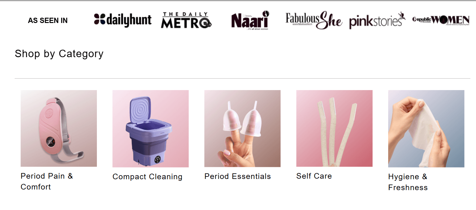

01 · First impression & brand voice
Strong, premium, unapologetically feminine visuals — but the proposition was unclear. New visitors could admire the aesthetic without understanding what Be Me offers or why it matters.
02 · Navigation & IA
The sticky nav helped visibility, but branded labels forced exploration instead of comprehension. Users needed clearer paths like Shop, About, Community, and Journal.
03 · Above the fold
Photography and large type created confidence, but the hero did not answer what Be Me is, what it offers, or why users should care. CTAs blended into the background.
04 · Visual hierarchy & flow
The page felt fragmented rather than narrative. Oversized visuals repeated often, while explanatory content and readable hierarchy did not carry users from problem to proof to action.
05 · Calls to action
CTAs existed but lacked contrast, urgency, and benefit-driven language. Users were not guided toward meaningful next steps like shopping, joining, or finding the right fit.
06 · Accessibility & responsiveness
Mobile adaptation was touch-friendly, but contrast on image-backed text and heavy effects risked excluding users on mid-range devices or with accessibility needs.
07 · Emotional resonance
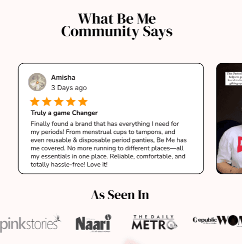
The brand communicated empowerment visually, but lacked testimonials, community stories, and social proof that could make the promise feel authentic and substantiated.
Design opportunity
Move from style-driven storefront to warm guided community: explain the value early, build trust before conversion, and make advocacy visible.
Competitor research: what the market was already doing
Clean, but clinical
Rael felt minimal and trustworthy, but Pee Safe felt generic and cold. The gap: warmth.
Personalization: powerful but busy
Honey Pot and Nua showed guided quizzes and bundles can help, but too much UI quickly becomes overwhelming.
Bold visual identity
Vibrant brands felt alive with playful type and real faces, but confidence needed intimacy, not noise.
Trust & credibility
Clinical testing, certification, subtle education, and transparency helped credibility — but warmth remained uneven.
Shared gap: real connection
No real-time support, few community events, no scroll-based emotional journey, and underused microinteractions.
Be Me strategic response
Add warmth, real talk, balanced microinteractions, authentic testimonials, AI chat support, first-purchase guidance, and community on the homepage.
Competitive positioning map
Product first
Community first
← Clinical / rational
Emotional warmth →
Rael
Honey Pot
Pee Safe
Nua
Be Me
Key user insights
Users want guidance, not just products.
Trust is earned before conversion.
Emotional support matters.
Too many choices feel overwhelming.
Community builds confidence.
Design opportunity: a private, medically accurate health assistant
Exploratory conversations with three women in their early 20s surfaced the same need: a judgment-free place to ask product, period, and wellness questions before purchase.
User Persona

Aanya Sharma
Age 20 · Delhi, India · second-year B.Com student
curious but cautious · budget-conscious · research-oriented · easily overwhelmed
About her
Aanya is navigating the confusing world of period products. She second-guesses choices, searches Google and Instagram, and wants shopping to feel like being guided by an older sister — safe, clear, and judgment-free.
Core need
“I want to feel safe, guided, and understood — like someone gets what it’s like to be a girl with a million questions and zero judgment.”
Pain points
Doesn’t know which product fits · Afraid of choosing wrong · Confused by terms like flow and absorbency · No one to ask honest questions · Long articles drain her
Empathy mapping
Core emotion → Overwhelmed by choice, confused about product fit, needs gentle guidance and safety
Think & feel
“How do I know which size I need?” · “Is this safe for me?” · “Who do I ask without being judged?”
Say & do
Checks reviews, compares brands side by side, scrolls fast, looks for ratings and social proof before trusting the product.
Hear
Cultural taboos, myths, pressure, and misinformation dominate her world — making period conversations feel hidden or shameful.
See
Boring clinical sites, identical products, long blogs, white-pants ads, and no beginner cues — everything feels either too adult or too clinical.
Pains — homepage level
Too many options · fear of choosing wrong · too shy to ask questions · unclear product differences · tone feels too adult or clinical · no trust signals upfront
Gains — what the homepage can give her
Feels understood · judgment-free answers · calm guidance · real reviews and trust signals · older-sister tone · someone to talk to · confidence even before buying
DEFINE
Synthesizing the research
Most observations pointed to five root problems.
Instead of treating the audit, competitors, and user needs as separate inputs, I clustered them into the core challenges preventing Be Me from delivering the supportive community-first experience it aspired to create.
Root problems
01 · The brand’s value isn’t immediately understood.
02 · Trust is established too late.
03 · Shopping feels transactional instead of supportive.
04 · Be Me’s community is underrepresented.
05 · The homepage lacks a clear narrative.
Design goals
Clarify the value proposition from the first screen.
Build trust before asking users to buy.
Guide users with education and reassurance.
Highlight community and social impact.
Create a storytelling journey from discovery to action.
Clarify
Reassure
Guide
Humanize
Lead forward
STRATEGY
Strategic foundation
Problem → Insight → Strategy Map
Problem
Key insight
Strategic response
The brand’s value isn’t immediately understood.
First-time visitors need to understand what Be Me does and why it is different within the first few seconds.
Clarify the homepage hero and build a story flow that communicates the mission before products.
Trust is established too late.
Health and wellness purchases need credibility, authenticity, and social proof before users commit.
Surface expert credibility, customer stories, community proof, and trust signals early in the experience.
Shopping feels transactional instead of supportive.
Many users are still learning about menstrual health and need guidance before making confident product decisions.
Introduce educational content, guided discovery, and an AI assistant for private judgment-free questions.
Community and advocacy work are underrepresented.
Be Me’s advocacy work is one of its strongest differentiators, but it is largely hidden on the homepage.
Highlight campaigns, real stories, city initiatives, and educational events to frame Be Me as a movement.
Warmth & real talk — a supportive space, not a storefront.
AI chat support, guided product discovery, and beginner-friendly education.
Community stories, advocacy, and medical credibility foregrounded early.
Features i added
Few Ideas I Couldn't Leave Out
These features wasn't part of the competition requirements, but after understanding the users and the brand, I felt it had the potential to make a meaningful difference. I wanted the experience to support women not only in shopping for products but also in navigating the questions and uncertainty that often come with menstrual health.
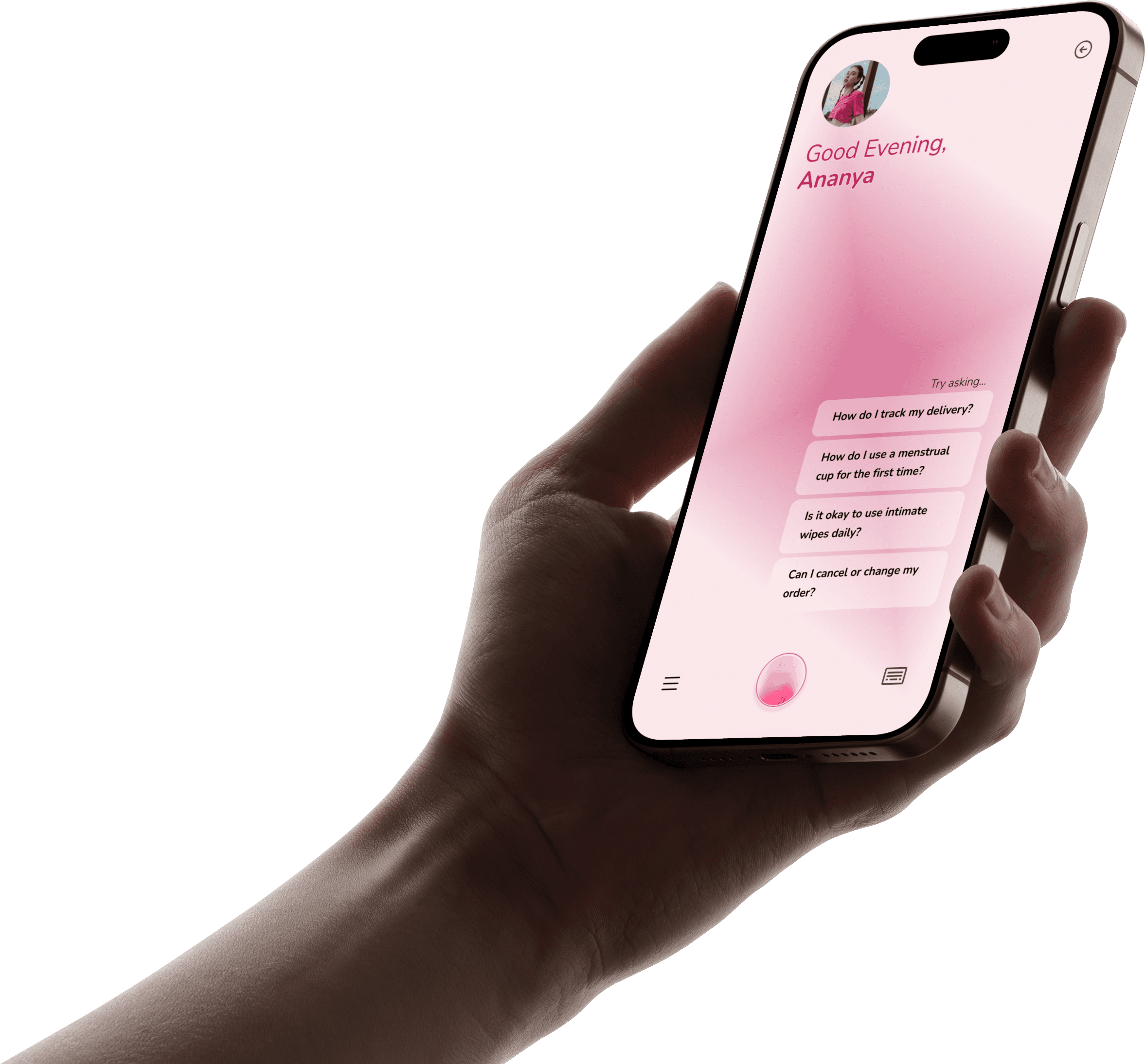
Didi — Your Friendly AI Assistant
While researching competitors, I noticed none of them offered real-time support for users with questions. So, I introduced Didi—named after the Hindi word for elder sister—a friendly AI assistant that's always there to help.
Whether someone is choosing their first period product, comparing options, or simply has questions about menstrual health, Didi provides instant, personalized guidance without making users leave the website or dig through long FAQs. It can even recommend products based on individual needs, helping users shop with more confidence.
Why I added it
Answers questions instantly, reducing hesitation.
Makes the experience feel more supportive and approachable.
Reinforces Be Me's community-first personality.
Fills a gap I found across all competitor websites.
Since Be Me already offered this first-time discount further down the homepage, I brought it upfront as a Welcome Gift to grab attention the moment users land, reduce purchase hesitation, and encourage them to explore with a little extra confidence. (Background designed in Canva; layout, copy, and CTA built in Figma.)

DESIGN
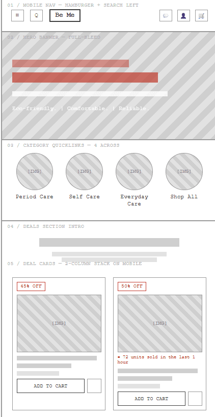
MID-Fidelity Wireframes -> Design






FINAL REDESIGN
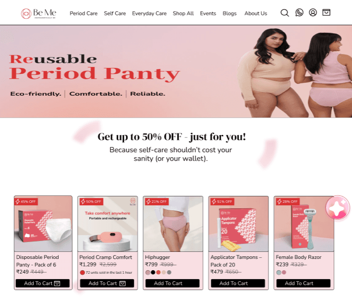
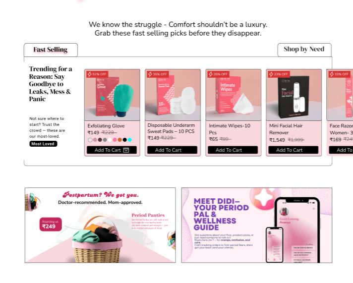

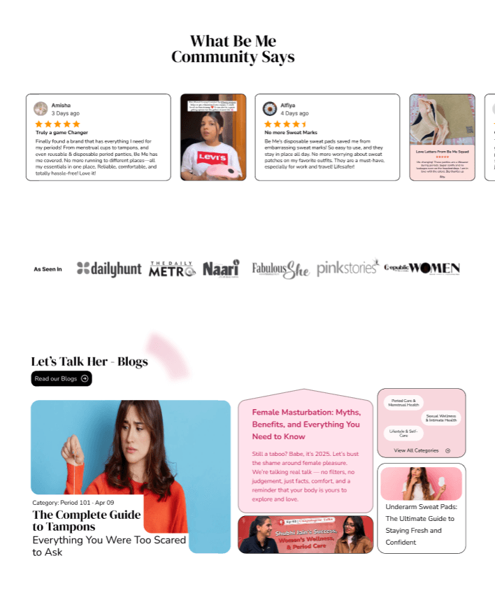
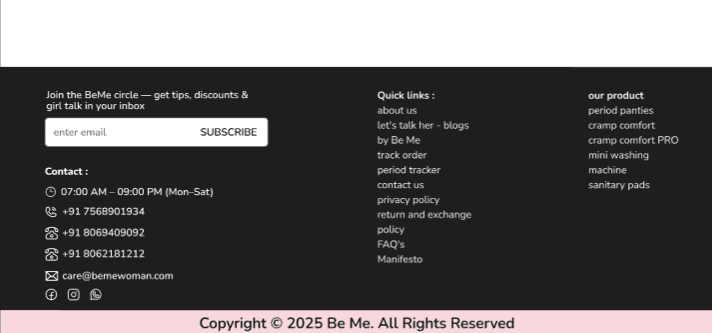
VALIDATE
Validate
Testing the homepage against clarity, trust, and confidence.
For a competition case study, validation focused on whether the redesign answered the brief: innovation, user experience, creativity, functionality, and accessibility — while making users feel safer and more guided.
Innovation
User experience
Creativity
Functionality
Accessibility
What I would test with users
Can users understand what Be Me offers in the first screen? Can they find product guidance without feeling overwhelmed? Do they trust the brand before seeing the product grid? Do they feel the tone is supportive rather than clinical?
What success should feel like
More confident product discovery, stronger CTA clarity, reduced decision fatigue, visible advocacy, and a homepage that reads as a supportive community before it reads as a store.
“Be Me’s homepage had to feel like a wise, warm older sister — not a doctor, not a shop, not an influencer.”
safe space
beginner-friendly
trust-first
quick clarity
real talk tone